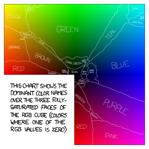
Randall Munroe’s Blag on XKCD.com (a robust sense of humor is required and rewarded on this übergeek comic site) recently released the results of a color survey that included more than 5 million named colors recorded over 222,500 user sessions. It is impossible to read much of the results and not burst out laughing and also realize that color is both intensely personal and emotional. Why do we pay it so much attention at some times and so little at others?
Part of the reason is that color is highly context sensitive, that is, we perceive colors to be very different depending on the background on which they appear and whatever colors happen to be adjacent to them. When Dan and I were giving a presentation titled “Data Visualization Best Practices: Know How to Improve Your BI and EPM Reports, Dashboards, and Queries at Collaborate 2010” a couple of weeks ago, we threw in some slides featuring some traditional “optical illusions” including some with color (mis)perception. Invariably, more people comment on the optical illusions than on the more substantive parts of presentation, despite the fact that most of us have been exposed to them since we’ve been in the fourth grade.
The best “simple” advice I have is to use color sparingly and carefully. Don’t underestimate its power.


